A scatter plot or scatter diagram is a type of mathematical diagram using Cartesian coordinates to display values for two variables for a set of data.
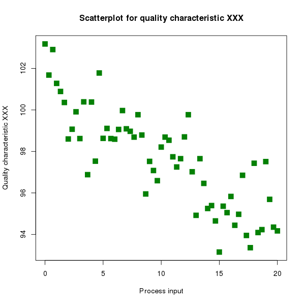
A scatter plot can suggest various kinds of correlations between variables with a certain confidence interval. For example, weight and height, weight would be on x axis and height would be on the y axis. Correlations may be positive (rising), negative (falling), or null (uncorrelated). If the pattern of dots slopes from lower left to upper right, it suggests a positive correlation between the variables being studied. If the pattern of dots slopes from upper left to lower right, it suggests a negative correlation. A line of best fit (alternatively called 'trendline') can be drawn in order to study the correlation between the variables.

A scatter plot can suggest various kinds of correlations between variables with a certain confidence interval. For example, weight and height, weight would be on x axis and height would be on the y axis. Correlations may be positive (rising), negative (falling), or null (uncorrelated). If the pattern of dots slopes from lower left to upper right, it suggests a positive correlation between the variables being studied. If the pattern of dots slopes from upper left to lower right, it suggests a negative correlation. A line of best fit (alternatively called 'trendline') can be drawn in order to study the correlation between the variables.